BIRT- IMPORTANT!!!!!, How to display multiple columns in a chart (ex. Pie chart
Hello everyone,
I'm working on Report where i have a dataset that includes three columns ( col1,col2,col3). the three columns are computed columns which based on a columns named (value).
Is there a way where i can display the three values in a pie Chart?
please see attached pic for better Understanding.
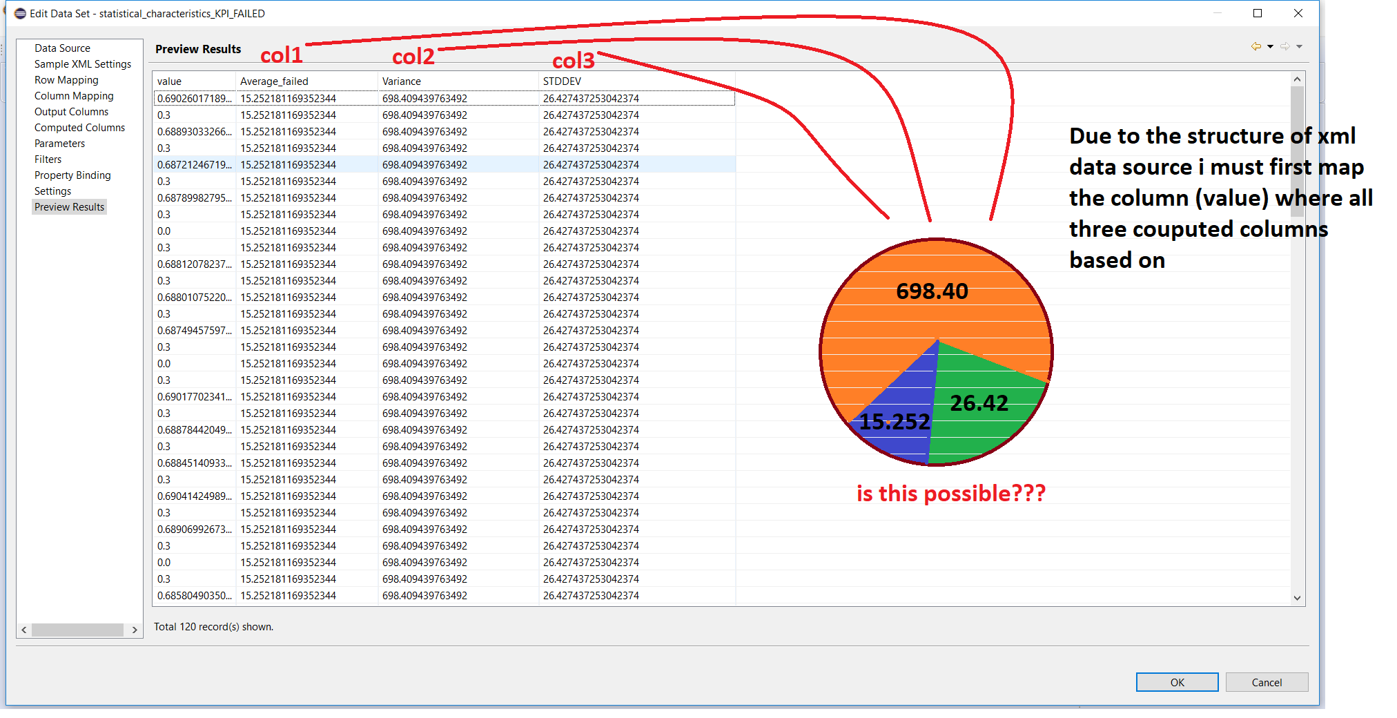
Please note that the dataset retrieve the data from an XML-Data source which has a fixed row to coulmn relationship
I would be grateful if i could get any help
Regards
Comments
-
The data set is not correct for the pie chart described. A different data set is needed. Add two columns to the data set- "computation_type" and "computation_amount". To convert the existing rows of data to the new rows, loop through all of the existing rows and do the following for each row in the current data set:
- Add a row to the new data set
- Set computation_type = "Average_failed"
- Set computation_value equal to the "Average_failed" value in the current row
- Add a row to the new data set
- Set computation_type = "Variance"
- Set computation_value equal to the "Variance" value in the current row
- Add a row to the new data set
- Set computation_type = "STDDEV"
- Set computation_value equal to the "STDDEV" value in the current row
You will be adding three rows to the new data set for each row in the current data set, so the new data set will have 3 times as many rows as the current data set. Create a pie chart with the category set to the computation_type column and the slice set to the computation_amount column.
Warning No formatter is installed for the format ipb1
Categories
- All Categories
- 108 Developer Announcements
- 53 Articles
- 106 General Questions
- 144 IM Services
- 43 OpenText Hackathon
- 32 Developer Tools
- 20.6K Analytics
- 4.1K AppWorks
- 8.9K Extended ECM
- 899 Cloud Fax and Notifications
- 77 Digital Asset Management
- 9.3K Documentum
- 29 eDOCS
- 120 Exstream
- 39.8K TeamSite
- 1.7K Web Experience Management