Simple Histogram Chart Report
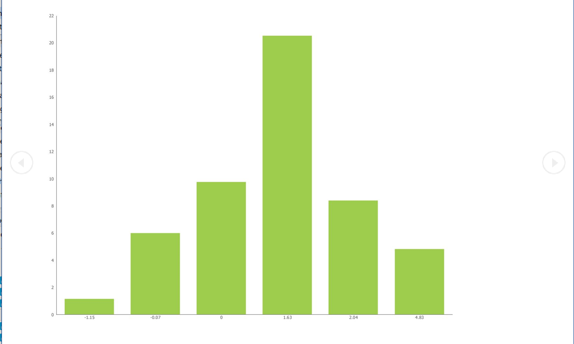
Using a Vertical Bar Chart control, and a single series of values, you create a simple Histogram Distribution chart by adding a simple computed column to spread the distribution above and below a zero point. Use the two value sets and create a correlated set which takes on the characteristic "bell-curve". Watch the X-Axis grouping to ensure you are counting the hits correctly.<br />
<br />
<br />
0
Categories
- All Categories
- 108 Developer Announcements
- 53 Articles
- 106 General Questions
- 145 IM Services
- 43 OpenText Hackathon
- 32 Developer Tools
- 20.6K Analytics
- 4.1K AppWorks
- 8.9K Extended ECM
- 899 Cloud Fax and Notifications
- 77 Digital Asset Management
- 9.3K Documentum
- 29 eDOCS
- 120 Exstream
- 39.8K TeamSite
- 1.7K Web Experience Management